Categories
Op Ed

Attention Creatives: please be amazing again!

Remember the good ole days when the Internet was cool? Must have been, what, 3 years ago? 5? Ages ago. It was so exciting and filled with promise. It seemed poised for an explosion that would fundamentally change the creative world. But now it all seems kind of tired. All the cool kids have left and now it’s a school cafeteria filled with Facebook and YouTube. What happened?

Remember what the Internet was like when it first started? When it was all text and all business, designed to be a nuclear-war proof communication system but opened up to research and academic institutions. Then support for graphics was grudgingly added. But they had to be GIF or JPEG, restricted to 216 “browser safe” colors if you wanted them to appear consistently from screen to screen. Then, as with most good things, it took artists and pornographers to show people how to use a new medium properly. Net.artists like 0100101110101101.org and jodi.org subverted the dominant paradigms and showed us it was possible to unleash unbridled creativity in this new medium.

Some of us were extra thrilled by the World Wide Web. We’d published zines and embraced desktop publishing because of its democratizing power. Before desktop publishing, the ability to get your message out to the world was concentrated in the hands of the elite who had the money to publish books, magazines and newspapers. Desktop publishing, combined with exciting new technologies like laser printers and photocopiers, and access to places like Kinko’s, meant that for a small investment ordinary people could get their thoughts out to dozens, even hundreds of people. It may not sound like much now, but at the time it was huge and revolutionary. The World Wide Web reduced the costs even further, and expanded our audience to the whole world (at least to the portion of it that had Internet access). It was obvious that the World Wide Web would be a world-changer.

Then a lot of amazing things happened. There were real destinations on the Web like Homestarrunner.com that we got excited about. If a friend was visiting who hadn’t heard of it, we’d drag them over to the computer to show them this amazing, hysterically funny thing that a couple ordinary people had done up in their spare time. There was so much coolness happening on the Web that we needed aggregator sites like Boingboing to keep tabs on it all.

Then the Web peaked, but we didn’t notice because it looked like the start of something so big that it would make everything else that had been done on the Web seem boring. Ze Frank’s The Show aired new videos of humor and social commentary every Monday through Friday for a year. Meanwhile, on Thing a Week, Jonathan Coulton recorded and released a new song every week for a year. Both sites leveraged many of the Web’s best new ideas. Jonathan Coulton released everything under a Creative Commons license that encouraged fans to re-record his songs, make music videos, illustrate the songs or creatively engage with the music in any way they saw fit. Ze Frank  also provided a variety of ways for fans to extend The Show beyond its short videos, including international collaborative creative challenges.

The Show and Thing a Week seemed like the culmination of everything good about the Internet. Two ordinary guys, self-publishing and becoming international stars. Their work broke down the barriers between author and audience, and made the world potential collaborators. Here’s where the Internet should have blossomed into maturity and become an explosion of creativity and innovation. Instead, once Ze and Jonathan ended their year-long experiments, the Internet appeared to wind down. Instead of looking at this as a starting point, it’s almost like there was a collective, “Well, this is as good as it’s going to get,” and everyone stopped trying.

I think there’s a few reasons why this happened.

Facebook. I blame Facebook, for starters. I think most of us have ideas we want the world to hear. Some of us are more driven than others. For almost two decades it’s been possible for anyone who wants to be heard to get their word out there. It just took a level of skill, effort and expense. Facebook reduces these all to zero, while still providing an audience that can be huge in comparison to other mediums. Unfortunately, there’s little incentive to do better. Take this post, for example. I’m putting more effort into it than anything I’d do on Facebook and yet a fraction of people will read it compared to my most banal post on Facebook. Before Facebook, we had blogs that filled the “I want to be heard” niche. Blogs reduced skill and expense to zero, but still required effort. You had to write, and what you wrote had to be interesting, readable and timely if you wanted to build an audience. On Facebook you have a built-in audience of friends and family who will read anything you post and “like” it. I believe that blogs for some were a gateway to bigger and better things, or at the very least, to better blogging, because the feedback loop encouraged it. The better your blog, the more comments and more traffic you got, which only motivated you to write more and better things. Facebook does the opposite, reducing creative output to a mere popularity contest. At the same time, striving to create content outside of Facebook is discouraged because when you’re starting out, you won’t get the same level of attention and positive feedback that Facebook gives.

It got too easy. For many creative types, it’s not just a desire to be heard that motivates us. It’s the feeling of accomplishment you get when you overcome a creative challenge. There was a time when creating quality content for the Web was challenging. In a short time, though, the tools got easier to use, browsers got more flexible, bandwidth increased, costs came down and everything got very easy. It was around this time that I started doing the Callithump! stuff, creating materials that existed only offline and trying to figure out what sorts of experiences I could create that could only exist off the Web. Around this same time we saw a resurgence in things like silk screening and letterpress, and yarn bombing and the whole “new” craft movement. I think a lot of people who might have once turned their attentions to making interesting things happen on the Web packed up and left for more challenging and “real” creative spaces.

There’s no “there” there. The Internet itself has changed from a specific destination and activity to more of an extension of ourselves. We don’t “surf” the Web now so much as inhabit it. It’s integrated with our daily lives. Even the most modest cell phone now has Internet access. We’re constantly connected in ways we don’t even realize. Getting maps and directions on our GPS, texting, checking stocks, looking up recipes in iApps, watching movies on Netflix On Demand. Not long ago we accessed the Internet through a specific device, a computer, with a specific application, a web browser. Things like Homestar Runner and The Show and Thing a Week are destinations that require attention and involvement in order to work, just like the Internet itself at the time.

Will the Internet ever be cool again? Technologically, all the pieces are there for a creative explosion the likes of which the world has never seen. We’re at a paradoxical point where although the media monopoly is stronger than ever, the mediums themselves are the most democratic they’ve ever been. The tools are easier and more affordable and there’s a diversity of publishing platforms. Whatever your creative desire, you have the means to reach a wider audience than at any point in history. We could be doing amazing things. I should be doing amazing things. And I will, once I get done updating my Facebook status.
Share
Categories
Op Ed

Freedom of Choice, Part 4

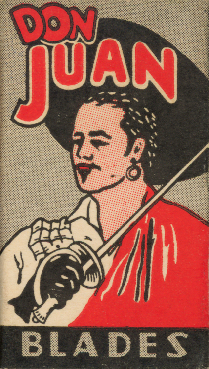
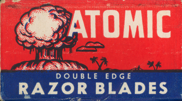
Atomic Razor Blades, for that radioactively healthy glow!


A recent piece in the Callithump! vending machine ended on a more downbeat note than I’d intended.  The three part piece, called Freedom of Choice (yes, after the Devo song) discussed how the Gillette company combined company founder King Camp Gillette’s “razor and blades” business model: sell something at little or no profit (in this case a razor) so that one might sell a lot of something at greater profit (the blades).

King Camp Gillette himself was actually a really nice guy, a Utopian Socialist who planned to use his great wealth to build a better world for everyone. It didn’t work out that way, and the company he started continued without him. The razor and blades business model got nasty by incorporating  proprietary formats (in this case plastic cartridges containing multiple blades) to eliminate competing blade manufacturers. Before Gillette (the company, not the man) did this, you could choose between more than 30  manufacturers who made blades that fit Gillette razors. Now in grocery and drugstores you can choose from Gillette or Shick razors and blades. These aren’t interchangeable. Once you buy a  razor, you have to buy specific blades that fit that razor. We went from having many choices from many companies to severely limited choices from two companies.

The razor and blades model is now pervasive. Companies sell need, not solutions. We buy a television, we need to get cable TV and buy a game console. We buy the game console, we need to buy peripherals and games to go with it. We buy a game and a year later the bigger and better version of that game comes out And so on, in perpetuity.Think about how many of the purchases in your life only guarantee you have to buy more.

It doesn’t always need to be this way. Of course, we’re consumers. It’s wired into in our animal natures. However, there’s genuine need and the perceived need that’s put into our heads by marketers. There are more choices, but they aren’t necessarily on the rack at the supermarket. The fact is, the multi-blade proprietary plastic cartridge razor blades never shaved better than the single-bladed safety razor. It was all just marketing.

I discovered this a while back. I was holding my 5-bladed Gillette Fusion with Lubricating Strip and battery-powered vibration, and I was trying to decide whether to torture myself for a few more days or not buy food because the blades were just so expensive, and I was thinking, There has to be something better. It turns out there was, and always had been. You can still buy safety razors of the sort King Camp Gillette first made. If you shop around you can still find safety razors that were made in King Camp Gillette’s day for cheaper than a Gillette Fusion. There’s all sorts of myths about these razors like, “They’re hard to use,” and “You’ll cut yourself.” This is true for about the first two weeks of using a safety razor (aka, dual edge or DE razor). Once you get the hang of it, you’ll get a far better shave than you’ll ever get from a 5-bladed monster razor.

What’s even better is, for the price of an 8 pack of Fusion cartridges, you can buy a pack of 100 Feather dual edged blades. Feathers are regarded as among the best DE blades you can buy, and yet they’re so cheap compared to the Fusion that you can swap out a fresh blade before it even shows signs of getting dull.

Make the switch to a shaving brush at the same time, and you’ll discover that there’s many more choices beyond the canned chemical goo that the stores try to pass off as shaving cream. In the morning I have the joy of a hot lather scented with things that I recognize, like lavender or lime, made with non-toxic, natural ingredients. Making the switch away from expensive gimmick razors has turned a morning chore into something I look forward to. I wholeheartedly recommend it!


Don Juan
You too can shave like the World's Greatest Lover!
Share
Categories
Op Ed

Here’s an Idea: Phone Booth Art

I’m full of ideas. Some good, some not so good. Some I’m keeping to myself to use later. Some I’ll just never get around to do anything with. Today, I’m going to start sharing the latter.

Idea #1: Art in or with Phone Booths

Why it’s a good idea: I don’t know where to find them, but I’m betting if you could find out, you could buy a phone booth for cheap. Like cigarette vending machines when Clark Whittington was starting Art-o-mat, phone booths are highly functional objects that are being made irrelevant by changing times. People use cellphones now, and booths are becoming increasingly hard to find. Think of the creative potential if you had one of these and it’s liberated from its original purpose! When the door closes it triggers a switch that turns on a light. You could modify this to activate any number of electronic devices. The space is large enough to encase a large human or two, while being small enough to fit inside a building. Meanwhile, they’re weatherproof, so you could do an installation outside. They’re soundproofed to a degree as well, so it would lend itself to incorporating sound into the piece.

Beyond the sheer functional possibilities of phone booths as art objects, they’re symbolically charged artifacts. Phone booths are a sign of a changing culture. There was a time when people could assume a right to privacy, even in public places. The phone company actually provided tiny, private rooms that people could go into, close the door, shut out the world and have a conversation. This was seen as something valuable enough to public space were provided for it. Where are these private spaces now? With the loss of these spaces, we also seem to lose the idea that there are things that should be private. There was a time when we didn’t have to listen to half conversations about disgusting medical conditions, broken condoms or bad breakups while trying to enjoy our chai lattes. Beyond all that, think of the phone booth itself. A used phone booth may have been in use for decades. Tens or even hundreds of thousands of phone calls took place within those confines. They ranged from banal to life altering. If there were batteries that could store the emotional energies of those conversations, they would have reached atomic bomb levels of power by the time the booths were retired!

Things to do with the idea: Personal space, communication, privacy, respect, change… all good material for art explorations! A phone booth could become an art gallery, giving private showings. The phone booth itself could become an art object. Take out the phone, put in a comfy seat, change the lettering on the outside from “phone booth” to “calm” or “alone time” and just provide people with a place to go and take a break from the world.

The phone booth as a creative tool seems so obvious. Artists should already have done many projects with them, and yet a Google search provides surprisingly little about the subject. I did, however, come across this wonderful site, the Payphone Project. It started out as an art project involving payphones. As the availability of payphones has declined, the site has become an aesthetic appreciation of the payphones themselves.

Could it be too late for such a thing? Are all the phone booths already scrapped? I hope not. There’s still a lot of creative potential to be explored. Get on it!

Share
Categories
Op Ed

iBanksy: Please tell me this is real!

iBanksy is a vending machine created by iArtistLondon that sells stencils of Banksy graffiti and a can of spraypaint for just £9.99!

iBanksy
Be your own Banksy!

When it comes to ideas striking the right note, this is a complete symphony! It might be just a hoax, but even if it is, it’s still a brilliant idea.

What does it mean when the work of an artist whose work sells at auction for upwards of £1 million can be reproduced by anyone with a stencil and a can of spraypain? What is relevant about the art? Is it the content, or the artist? What is “real” art? It’s not a simple question. One might assume that an “authentic” Banksy would mean that he cut the stencil and spraypainted the wall himself. This particular standard of authorship is far from universal. Most of the grand masters had teams of assistants working for them. A painting by Monet might actually have been done by Team Monet, with the majority of actual brush strokes made by anonymous assistants. Since Banksy encourages people to appropriate his images and reproduce them however they see fit, couldn’t these faux Banksys be seen as his assistants, and all reproductions of Banksy’s work real Banksy? If Banksy himself cut the stencil and handed it to someone else to spray, would it be real? If Banksy bought a stencil at JoAnn’s Fabrics and stenciled it himself, would that be real?

At the same time, we’re actually assuming that there is a real Banksy. Banksy chooses to remain anonymous. Banksy could actually be a group of people claiming to be the same individual, like Alan Smithee. Further complicating matters is Banksy’s own ambivalent attitude toward authenticating his (or her or their) own work. Pest Control, the allegedly official group that authenticates Banksy’s work, has this to say:

‘[Banksy] would encourage anyone wanting to purchase one of his images to do so with extreme caution, but does point out that many copies are superior in quality to the originals.

”…Banksy has a casual attitude to copyright and encourages the reproduction of his work for your own personal amusement, so it’s with regret that he finds himself having to deem pieces either “real” or “fake”.’ (source)

Which is all just to say, we need vending machines like iBanksy in the world, to raise such questions in such a fun and interactive way!

Share
Categories
Op Ed

Small in Japan: Japanese Vending Machine Culture

From what I can tell, vending machines play a very different role in Japanese culture than they do in the US. In the US vending machines are on the fringe, even though they’re in the most public of places. For instance, they sell toys to distract children while the grownups shop. Or they sell items beyond the purview of the establishment where they reside, such as condoms & sanitary napkins in the bathroom of a bar, junkfood and soda in an office building. They’re there to fill a need, but the contents are usually overpriced and/or poor quality. You only go to them when you have no other choice.

In Japan, on the other hand, vending machines have a much more seamless integration with the rest of the culture. They’re everywhere, targeting all age groups. The contents are much higher quality than what we get in the States (outside of Callithump! machines, of course). I’ve been fascinated by Japanese vending machine culture for a while and whenever I know of anyone traveling to Japan, I always ask them to bring me back something! Here are a few:

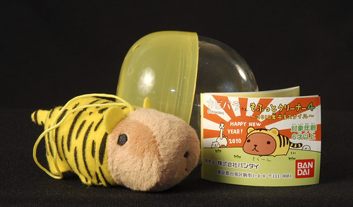
tiger thing
It's a hampster disguised as a tiger, designed to be attached to a cell phone.
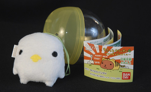
I guess it's supposed to be a chick, or maybe a ghost, desguised as a chick, or vice versa? Again, to hang on a cell phone
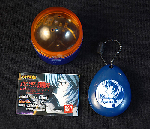
Rei Ayanami
This is a Rei Ayanami keychain. It's got a big button and, when pressed, Rei Ayanami's voice comes out of it. It's pretty neat that 15 years after Neon Gen first aired, it still has enough of a presence in Japanese culture that this sort of product is still viable. I can't think of anything similar in the US.
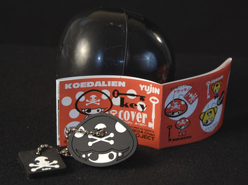
Co-ed Alien
A Koedalien Key Cover, apparently.
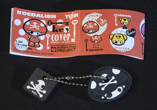
Koedalien Kloseup
Detail of the Koedalien pamphlet, inluded with the keychain
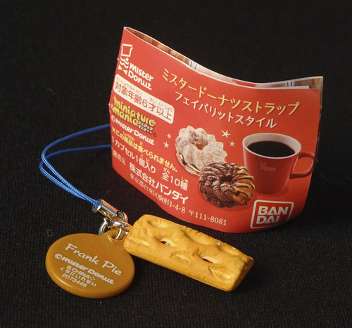
Frank Pie
For reasons I can't explain, minature replicas of food are very trendy in Japan right now. This is a Mr. Donut Frank Pie cellphone fob.
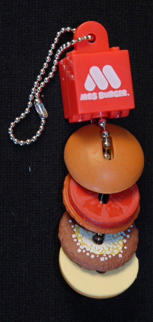
Mos Burger
More minature food. This time, a Mos Burger keychain, complete with separate patty, tomatoe slice, and bun!

A nigh infinite variety of things get vended from vending machines in Japan, from air to used schoolgirl panties, although these pictures are all of keychains, keychain covers, and cell phone fobs. But just look at the astonishing variety of things in that tiny subset!

If anyone out there can tell me more about vending machines in Japan, I’d love to hear from you! And if you’re in Japan or traveling there and can hook me up with vending machine schwag, I’ll reward you handsomely!

Share
Categories
Op Ed

Return of the Real

In a way, I started Callithump! as a form of rehabilitation. I’d invested so much of my time, thought, and creative energies into the Internet that if it wasn’t on the Internet it wasn’t real to me. So I set out to rediscover the point to having a physical existence. From the creative standpoint, I wanted to explore what kinds of ideas could only be communicated in the physical space. Things like smell, texture and taste just don’t translate into cyberspace. There’s also a feeling of intimacy, a sense of interaction, that you get when you can pick something up, roll it around in your hands, put it in your pocket or pass it on to a friend.

I don’t think I’m alone in my need to explore the real. I think I’m just part of a much larger trend.

Over the past few weeks I’ve been attending crafts fairs as go-to boy for Jess. What’s been remarkable to me is how different these crafts fairs have been to the stereotypical ideas of a crafts fair. I didn’t see a single crocheted toilet seat cover, or a knit Barbie doll Southern Belle ball gown toilet paper cozy (much to my dissappointment… I really wanted one!). Instead, there was a rich variety of young craftspersons, many of who seem to be rediscovering traditional analog methods of production like silkscreen, letterpress, sewing and knitting. But the traditional techniques have been remixed to become hipper, edgier, contemporary. If only I’d realized that what I was seeing was going to be so cool! I would have brought my camera along and taken a lot of pictures so you could see what I’m talking about!

I really hope this is a growing trend, not just the trend of the minute. If it is a growing trend, why is it happening? It’s easy to take the default position and blame the economy. Money is tight, so people are trying to make a little more by making and selling stuff in their spare time. That might be part of it, but I think it’s more. Here in the US we’ve seen an end of quality and uniqueness as nearly all manufacturing has gone overseas. We’re left with mass market crap made in sweat shops and sold at WalMart. It’s cheap because it’s cheaply made, and it’s all the same whether you buy it in Bangor, Maine, or Pasadena, California. If you’re shopping for a present, kind of gift is that? Wouldn’t you rather buy something hand-crafted by an artisan who you can actually talk to when you buy it?

I think it’s also happening because i’m not the only one who’s nostalgic for the real. We’ve traveled far down the digital path, and many of us spend more time on Facebook than seeing our friends actual faces. We’re spending money on things that are only nominally real, like songs on iTunes, that don’t have any physical substance, and the only thing you’ve actually bought is the right to listen to a song on a limited number of devices. We’ve been filling our lives with things that are temporary, impersonal, intangible, and ultimately unsatisfying. I think people are rediscovering the joys of “real stuff made by real people.”

Thank goodness!

Share
Categories
Op Ed

Penis Caskets: Another Condom Art Vendor

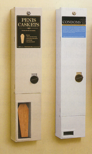
Here’s an almost good idea from ad agencey BooneOakley, Penis Caskets:

Penis Casket
Penis Casket
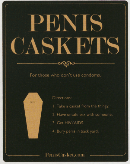
Penis Caskets Text
Penis Caskets Text

My first impression, as with most vending art projects, was, “Damn, that’s so cool! I wish I was close enough to buy one!” But then, on closer inspection, it misses the mark. Unless there’s some magic of engineering going on, there’s no way this machine could actually vend caskets, so the casket in there is “for display purposes only.” This negates the potential for interactivity and defeats much of the point of using a vending machine in the first place. But then the message is really lame in the first place. Ultimately, it rings out as hollowly as a DARE school assembly, stating the problem in such bipolar terms that you either accept it or reject it, but you can’t actually think about the message and make an informed decision for yourself.

This is a shame, because preventing the spread of HIV/AIDS is a worthwhile cause. I think with any campaign like this, you have to ask yourself, do you want to look cool, or do you want to be cool. This campaign is all about looking cool. If the goal is to get people to use condoms, though, you could take all the money that the campaign cost and put it towards providing free condoms. I’d be willing to bet good money that more transmissions of STDs would be prevented that way. Fortunately for BooneOakley, it’s unlikely that the success of this project will be measured in any way. With an advertising campaign you can measure if it’s successful because there will be a corresponding increase in sales. Theoretically, with a campaign like this, one could also measure a decrease in new HIV/AIDS cases. I suspect that MTV is more interested in appearing to make a difference than actually making a difference, and they’ll never bother to test for success.

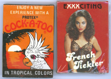
Just look at the juxtaposition of the Penis Casket vendor and the condom vendor. That condom vendor is bleak, white, boring. Taken together, the whole piece reads, “Condoms: they totally suck, but they’re better than death.” It seems to me a much better approach would be to up-sell the condoms, like they did in the Golden Age of Condom Vending Machines, back in the ’70s:

Vintage Condom Packaging

If the goal is to get more people using condoms, make the condoms more enjoyable to use!  As Robin Williams once said, “God gave us a penis and a brain, but not enough blood to use both at the same time.” An appeal to reason will have little effect on a man in heat. However, the promise of More Better Sex just might get through.

If Google is any indication, The Penis Casket campaign seems to have been a complete failure (unless it hasn’t actually started yet). The only search result was this blog entry by a woman who auditioned for a part in the Penis Casket commercial. The only other reference I could find to it was in Communication Arts magazine. It’s probably just as well. Vending machine art should be much cooler.

Share
Categories
Op Ed

Comic Sans? Hell Yeah!

You can spot the amateur graphic designers even without seeing their actual work. They’re the ones who always proclaim loudly that you should never use Comic Sans and rail on about how horrible it is. They’re even insulting to laypeople who happen to use it. Case in point, this comment from Reddit:

Comic Sans: My wife refused to stop using it. Tonight I finally broke her by explaining it thusly: Using Comic Sans is like having bad body odor – you don’t notice it, your friends can’t stand it, but nobody is impolite enough to tell you.

Yes, that block quote is in Comic Sans, in case you’re lucky enough to be one of the normal people who don’t give a toss about fonts. In it’s not displaying properly on your computer, here it is again:

comic-sans

So great is the hatred for Comic Sans that even the Wall Street Journal noticed. There are even petitions out there to ban Comic Sans entirely.

Amateurs. Every single one of you is labeling yourself as an amateur through your vociferous condemnations of this font.

A professional designer knows that font choice is just one small aspect of a design. A decent designer could be restricted to using a single size of Comic Sans and still create a great piece. There are many, many tools in the designer’s toolbox. A good designer doesn’t discard any of them. Not even when it’s trendy to say you hate that tool. There might be a time when Comic Sans is your best option.

Years ago, I had the good fortune to take a class from the late, great P. Scott Makela. He taught me a lesson I’m eternally greatful for. On the first day, he had us pick our favorite and our most despised fonts. We had a lengthy discussion of what we loved and what we hated about the fonts. Then, for the rest of the class, we could design exclusively with the fonts we hated. “Find a way to make it work. Do whatever it takes,” he said. And we did. As annoying as it was at the start, I really learned a lot from that experience. Most designers take the easy approach to a design, choosing fonts that are hip, stylish, easy to work with. Down that path you’ll create work that is quite serviceable, safe, and boring. However, if you start with a font that you think you shouldn’t use and push yourself to make it work, you have the potential to create something unexpected and better than what the “safe” designers do.

Even if you’re not interested in challenging yourself to become a better designer, there are still times when Comic Sans is appropriate to use. Notice the lower-case “a” in comic sans. It actually looks the same way a real human would write a lower-case a. This makes it a great choice for teachers creating content that’s geared toward kids who are learning to read and write. Sure, there are other fonts out there that have a’s like this, but you’d have to seek them out and install them. Quite frankly, most school teachers are really busy being teachers, and most second graders aren’t going to insult you if you use Comic Sans.

Comic Sans is also useful because of its ubiquity. It’s on pretty much every computer out there, so if you design something that someone else needs to edit, you’ll have better luck maintaining a consistent look and feel if you use it. For people who are supposed to have their fingers on the pulse of culture, graphic designers can be out of touch with the real world. For example, one argument against Comic Sans is that there are better fonts out there that achieve the same effect, and you should find, download, install and use them instead. This is good advice for the freelance designer or aspiring comic book artist working at home, and if you can’t follow it, you probably should be looking for a new line of work. However, many people are working in environments where they have absolutely no say in what gets installed on their computers. Many others haven’t the skills to do that, or the time to acquire them and they shouldn’t have to. These are the teachers and administrative assistants who’ve been asked to do up a flyer by someone who sees their time is more expendable than their own. They want that flyer to have a friendly, casual feel, and of the seven fonts they have access to, Comic Sans works best.

Honestly, when Doris hangs up a flyer she made announcing an ice cream social down in Meeting Room G to celebrate Gretchen’s 25th year with the company, are you going to complain about the font? Or are you going to be happy about FREE ICE CREAM!?

So, ignore everyone who says not to use Comic Sans. If you don’t know why you shouldn’t use it, you’re probably not creating content where it matters anyway. If you know you shouldn’t use it, you’ll become a better designer by putting your energy into finding ways to make it work instead of insulting people.

Update: Here’s a great piece that Jad Limcaco wrote a great piece on the history and use of Comic Sans, including examples of Comic Sans used for great design.

Share