Categories
Education

A Blog for Learning

Yesterday I had a telephone interview for a position as an academic technology consultant. I’m not sure how it went, but I can say that once I hung up the phone I immediately started to realize all the right answers I should have given.

The one question in particular that I should have answered better was, “If you had a new professor who wanted to use technology in their classroom, what would you have them do?”

I answered, I’d have them start a blog.

It’s the right answer, and I stick by it. I just don’t think I articulated my reasoning for it very well. So I’ll articulate it here so I can feel better about my answer.

A blog can be the cornerstone to a vast amount of learning. At the same time it’s very simple to get started with one. A new instructor has a lot on their hands so starting with something simple that they can grow with makes a whole lot of sense.

The professor starts the blog and the first thing they do is post the syllabus there. A printed syllabus is easy to lose, but having it online means it’s always there for the students to refer back to. It also makes it easy to revise and update if the needs of the class change.

Assuming they’re using WordPress as their blogging platform, the professor can choose a Multisite installation. Every student can have their own blog, and it can be set so that only people inside the class can see it. Students can post all their homework to the blog and they can view and comment on each other’s work. If students have questions about an assignment they post them to the blog instead of contacting the professor individually, and the whole class can benefit from the answer. Class discussions can extend online here as well, and the blog helps to create a learning community.

Many students are more adept at communicating online than in public. They’ve grown up with social media. Adding the blog provides a way of meeting students where they are and provides an additional venue for communication.

With all the student’s work online, the professor has a great tool for assessment. A traditional model is for the professor to collect papers, correct them, record a grade and return the papers to the students. At the end of the semester all they have is that recorded grade to show the student’s progress. With the blog, all the actual content has been retained and the professor has a much better view of what the student has learned throughout the semester. This has personally provided an incredibly valuable assessment tool. Some students just don’t stand out in class, but a close examination of their work reveals that they were actually putting a huge amount of effort into everything they did.

At the end of the semester the professor has a document that has recorded a large portion of the learning activity that happened throughout the semester and this can be used to build the class next semester. Every question a student asked can be used to revise an assignment to make it clear up front and undo a distraction before it happens. Looking laterally, are there assignments students did uniformly badly on? That might indicate a problem with the assignment, not the students. Everything that was created this semester can be built on for next semester, making the class content better and the class itself easier to teach.

So, yeah, the new professor should start a blog. That’s a great answer. I’m not sure I articulated why it was a great answer in the interview.

Also, blogs just sound unimpressive. I should have probably said something like:

Technology allows us to implement problem-based approaches to learning. We can use it to involve students and enrich lessons by solving real-world problems. We give students a problem to solve. For example, “The majority of waste going into our nations landfills are kitty litter and used diapers. Stop it.” The professor can have a specific goal in mind that she can state up front or guide the students to, such as “Students will implement a curbside recycling program for used diapers and kitty litter.”

Working with that challenge, students would start with research that would lead to new questions. Why isn’t this waste composted? Can it be composted in a way that eliminates toxicity?

With tools like Skype or Facetime, this research can go beyond just Googling web pages. It can incorporate primary sources so students can speak directly to people who are working in relevant areas.

With the many collaborative tools available, this could be a cross-disciplinary class involving biology, engineering and marketing classes (find a solution, build a solution, sell the solution). Collaboration could extend beyond the campus to other researchers and to towns where the solution could be implemented.

Data would need to be gathered, analyzed and shared, all enabled by technology.

I could go on and on, but ultimately, the class would be transformative for the students and create a world-changing solution that people really need.

It’s what education should be and it’s completely do-able with intelligent and strategic integration of technology into education. I could totally make it happen, given the right support.

It’s an answer that would have sounded a whole lot more impressive in an interview, too.

I was honest, though. Full technology integration and meaningful, world-changing experiences are the end goal. That’s not a responsibility I’d wish on a new professor, though.

You start with a blog.
Share
Categories
News

Welcome to the Present

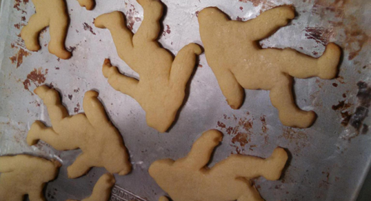
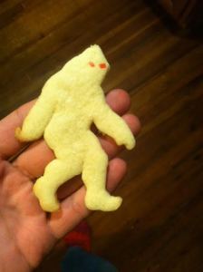
My friend Peter just emailed me a picture of the cookies he’d made for Halloween:

unfrosted
Frosted Bigfoot Cookie

While I always enjoy a good picture of food, I don’t usually get so excited that I want to share it with everybody. In this case, this is something amazing. Revolutionary, even, and that’s not a word I use lightly.

We’re seeing stories of the amazing things that are being done with 3D printers daily. A father making prosthetic hands for his son, for example, or a man designing a 3D printable handgun. Most recently, NASA is sending a 3D printer to the ISS so that astronauts can print the parts they need when they need them rather than wait for cargo to arrive on a rocket from Earth. These are amazing things to be sure, but not quite as amazing as Peter’s Frosted Bigfoot Cookie.

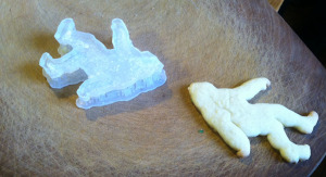
The story is simple. Peter wanted a Bigfoot cookie cutter. Instead of buying one, assuming one could be found that would be delivered in a timely fashion, Peter hopped onto his laptop, designed one, and printed it out.

cutter
Bigfoot Cookie Cutter

What’s amazing about this is that it is completely mundane. It’s a totally unremarkable situation, needing an everyday object that you don’t have. It’s a situation we all find ourselves in all the time. Since Peter had a 3D printer on-hand (purchased for less than what a black and white print laser printer cost in the 90s) he simply made a file and printed it.

This is why 3D printing is revolutionary. It’s something that can, and will be used to meet practical needs of our day-to-day life. Real revolutions happen in the kitchens of ordinary people.

Share
Categories
News

Naptime: Call for Submissions

Good news everyone! We’re starting a new publication called Naptime, and we’re looking for collaborators.

Naptime is intended to be primarily for and by creatives with kids (or similar afflictions). In the before time, we were two highly productive, creative people. Now, with a 10.5 month old daughter in our lives, our creative time is restricted to when she’s napping. We have no regrets and love our daughter more than we knew it was possible to love. However, it’s still a struggle to retain and maintain former creative practices.

If you’re a creative with children, you know exactly what we’re talking about. If so, we’d love for you to contribute! We’re looking for poetry, prose, artwork, photography and other creative content. It doesn’t have to be about your kids. This is about the moments you steal a bit of time away from all the other demands for your attention to do something that makes you happy, or lets you feel like the you that you used to be.

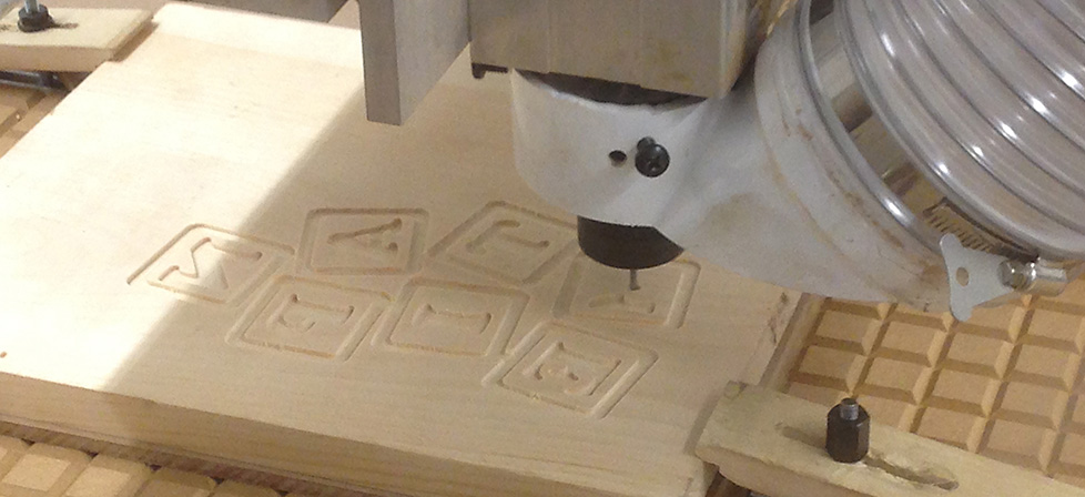
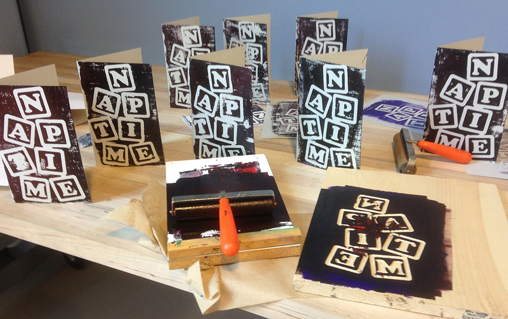
We’re going back to our roots with the format, back to the 80’s zine “photocopier and a stapler” sensibility that got us started. The general format will be 8.5″ X 11″ sheets, photocopied, folded and stapled. So ideally, content should be expressable in black & white, within the confines of of 5.5″ X 8.5″ pages made of  paper. However, since we have the resources of the IMRC Center at our disposal, we’ll probably stray pretty far from that format. The cover of the first issue, for example, is a wood block print that was cut using the Center’s CNC machine. Upcoming issues will most likely feature laser cutting, embossing, cut vinyl, 3d printing, screen printing and whatever else strikes our fancy, just because we can.

Payment will be in contributor’s copies and initial print runs will likely be just enough for the contributors. If we get a crazy amount of positive feedback on this idea we’ll go bigger, but for starters, this is just a fun way to explore the creative possibilities of naptime, and hopefully get others to join in!

If you’d to participate, please fill out the form at the bottom of this page.

IMG_1354
Naptime cover in production.

Please tell us what you'd like to contribute and we'll get back to you as soon as Gwen takes a nap!

* indicates required field
Share
Categories
News

Onward and Upward

It’s time to take things in a new direction.

Callithump! has been, in large part, a research project. Our goal has been to explore the role of the physical object in creativity in an increasingly digital world. Digital mediums raise questions about things we took for granted:

  • Why publish a “dead tree” book when eBooks are cheaper and more convenient?
  • Why publish a physical newspaper or magazine when websites can distribute that information more timely and to a wider audience, inexpensively and with ease?
  • Why distribute music on any physical object at all?
  • Why create or distribute any image non-digitally when digital tools offer so much power and flexibility, are non-toxic and require no cleanup, as well as “Undo” to take back a mistake and “Save As” to branch off the artwork into multiple creative directions.

Distributing creative output through through capsule toy vending machines was a way of exploring “why.” It wasn’t just a way of being cute or clever. It was an attempt to provide experiences that could only be had in the non-digital domain. There was that first act of putting the quarters in the machine and turning the lever, the clank of the capsule as it descended the chute, prying open the capsule to reveal the prize within. It was an experience that tapped into earliest childhood memories, and something that couldn’t be replicated on the Web. More important than the means of distribution, the content itself was vital. We always strove to create content that couldn’t be reproduced in any other medium. In a capsule we could include content that was sculptural or was wearable, or included scent. It could be touched, shared, put on a shelf or given away. The process of creating content for, and maintaining these vending machines showed us there’s worlds beyond the computer screen. We also learned that the rise of the digital can be a liberating in terms of physical creation. The gruntwork of communicating information can be shifted onto the web while freeing up physical media to be more interesting, creative and explorational. Meanwhile, the digital medium presents a challenge to the physical: Create something unique. Create something that’s irreproducible in any medium other than what it was created in.

It’s been a fantastic learning experience but it’s time to go bigger. I think we’ve taken the capsule vending machines as far as we care to. It’s time to turn them over to someone new who will make their own discoveries with them.

We want to take what we’ve learned and apply it to a bigger scale and go beyond what’s possible when your creativity is contained in a capsule.

We’ve got a lot in the works, and over the upcoming days (which are likely to be weeks and months, as fatherhood permits) I’ll be sharing those plans, as well as reflecting on the changing nature of media.

Stay tuned!


Share
Categories
News

Because: Baby

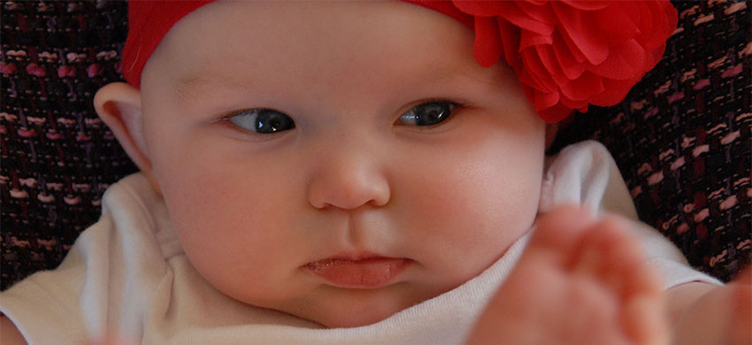
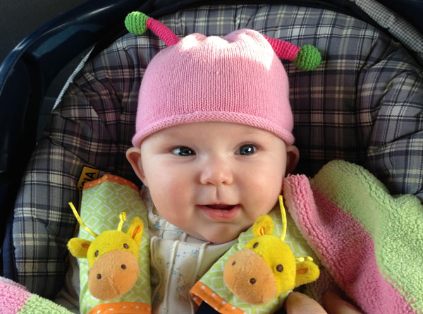
September 19, 2012 was the official release date of our finest work: Gwendolyn Aurelia LeClair. It’s been a happy, scary, wonderful, stressful time. While everyone who knew anything about babies warned us we’d be incredibly busy nothing could have prepared us for just how every single waking moment would be taken up with our new baby.

Callithump! has been put on a back burner because of this. Well, more like on a back shelf in the fridge, intending to be gotten to just as soon as we have a moment that keeps seeming like it’ll arrive at any moment, and suddenly it’s almost half a year later and that moment still hasn’t arrived.

So, if you’ve sent us a message, bought anything from us, made plans with us or anything along those lines, we beg your patience and your forgiveness. We’ve had way more on our plate than we ever thought possible. We still love you. If you’re waiting on us for something, you might want to remind us, though!

gwen

Share
Categories
News

Bangor-area artists transform old newspaper vending machines into art installations — Living — Bangor Daily News — BDN Maine

Bangor-area artists transform old newspaper vending machines into art installations

By Katie Day, Special to the BDN

Posted Aug. 08, 2012, at 4:18 p.m.

Terri Sanzenbacher was inspired by Shakespeare and named her piece after his famous quote “All the world’s a stage.”

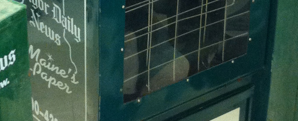
BANGOR, Maine — Downtown Bangor will be decorated with some unique art installations from 5 to 9 p.m. Friday, Aug. 10. The Penobscot Theatre Company, in partnership with several local artists, will unveil Art Outta the Box, a self-guided art installation in which the artists transformed old newspaper vending machines — donated by the Bangor Daily News — into artistic visions.

The project began after PTC board director Mary Budd and PTC staff toured the Bangor Daily News facility last spring and discovered the unused newspaper machines in storage.

“Destined for the trash heap, they seemed ripe for reinvention, so we thought, ‘Let’s turn some of these cool artifacts into art!’” Budd said. With the newspaper’s blessing, PTC took the machines and challenged local artists to transform them into something representative of theater.

“We’re thrilled to be participating in the Artwalk and helping to get great art out of the box and into the community. The creative spirit is alive and well in Greater Bangor,” said PTC artistic director Bari Newport in a press release.

The boxes have taken on a wide variety of new identities, inspired by plays and playwrights. Artist Carol Michaud designed a sculptural piece, bringing Audrey, a bloodthirsty plant from “Little Shop of Horrors,” to life, and making the newspaper box unrecognizable. This piece will be placed in front of the Charles Inn in West Market Square. Carol Brooks covered her box with magnolia blooms inspired by “Steel Magnolias,” a play that PTC has produced in 1995 and 2009.

Terri Sanzenbacher was inspired by Shakespeare and named her piece after his famous quote “All the world’s a stage.” She collaged well-known faces from many eras onto the sides of her box, finishing it off with text. Annette Dodd, co-owner of the Rock & Art Shop and a jewelry maker, created a box called “Picasso at the Lapin Agile” which will be placed outside of the Rock & Art Shop. The Central Street Farmhouse also will display one of the box creations. Amanda Boudreau’s design inspired by “Singin’ in the Rain,” which is topped with a black umbrella, will be featured outside the store.

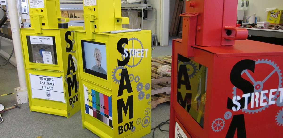
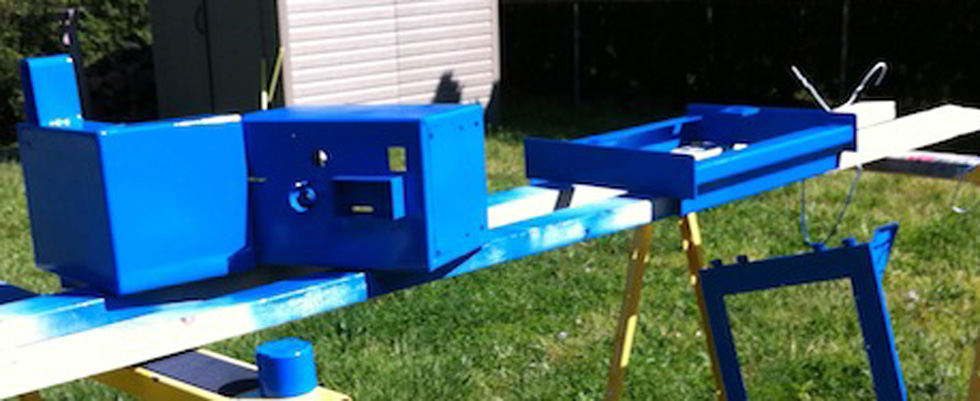
Also participating in the project is a group of artists associated with the University of Maine’s Intermedia Master of Fine Arts program. Owen Smith, Kate Dawson, Jess LeClair, Matt LeClair, Amy Pierce, Heather Perry, Peg Killian, David Colagiovanni and Neil Shelly all have been working hard to transform the newspaper boxes into functional pieces of art for the community. Kate Dawson, who has spearheaded the project, is hoping to make “Street Art Machine Boxes,” also called “SAMboxes.” Her hope is to create artwork that will stay in the community by getting local businesses to sponsor the boxes over the long term.

“We’re excited about the opportunity to support the Penobscot Theatre while giving area residents and visitors new ways to experience art,” Dawson said in a press release.

In addition to the shops listed above, the art pieces will be on display at Epic Sports, Rudman Winchell, the University of Maine Museum of Art, Thistles Restaurant and other prominent downtown Bangor locations. Maps of the Artwalk will be available in several locations, including the University of Maine Museum of Art, The Maine Discovery Museum, Blue Heron, Metropolitan Soul, Epic Sports, Giacomos and The Rock & Art Shop.

PTC also will be hosting a silent auction of the transformed boxes at the Bangor Opera House during the Artwalk on Aug. 10. More information and instructions are available online at penobscottheatre.org, at the Bangor Opera House or on the Downtown Bangor Arts Collaborative’s Facebook page, facebook.com/DowntownBangorArtsCollaborative.

via Bangor-area artists transform old newspaper vending machines into art installations — Living — Bangor Daily News — BDN Maine.

Share
Categories
News

This should be exciting!

More news to come!
Share
Categories
Rambling

Belfast Panorama

I’ve been taking a break from the Internet as a creative tool. I’ll come back to it some day, but for my current creative direction, I’m more interested in endeavors that make something that can be held and not just watched onscreen. There was a time, though, when I was really caught up in it. Sadly, most of that work is gone now, accidentally or intentionally deleted, or just plain misplaced. I just came across this one, though. I made it when we were living in Belfast. It’s hard to believe that this was our front yard!

Panorama shot in Belfast Harbor, Maine
Share
Categories
Rambling

Design Inspiration: A Typeface for Every Line

A lesson that gets drilled into you in graphic design class is to use just one typeface per design. Two are sometimes permissible, but only if one is serif and one sans serif. However, if we look to the past, we see a different story:

Almost every line uses a different typeface and yet the design is still elegant. How? How were they able to make this work? I think there’s a lesson here. Design rules are just there to keep amateurs out of trouble. A true designer makes their own rules.

Share
Categories
News

Eric Toscano’s Vending Machine Project

Eric Toscano is an MFA candidate at the University of the Arts in Philadelphia, PA. His thesis exhibition involves a newspaper vending machine. You can follow his progress here. You can learn more about Eric from his website.

Of course we’re exited about Eric’s project. Not only because it’s a vending machine are project, but also, as we said before, the broadside, or “newspaper” as it came to be called, was originally the domain of artists, poets, writers and political activists. It was co-opted by news publishers in the 1700s as a way of avoiding paying taxes. With newspapers on the decline, it’s time to steal the format back! We had plans for doing our own projects using newspaper vending machines but could never obtain any! Naturally we’re quite jealous of Eric’s vending machines! But we’re still looking forward to seeing how his project unfolds.


Share