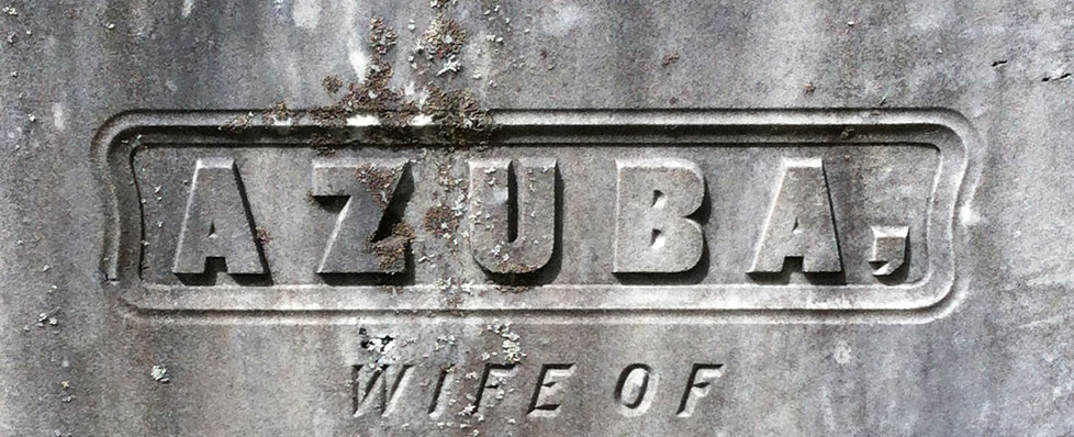
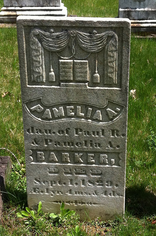
A lesson that gets drilled into you in graphic design class is to use just one typeface per design. Two are sometimes permissible, but only if one is serif and one sans serif. However, if we look to the past, we see a different story:
Almost every line uses a different typeface and yet the design is still elegant. How? How were they able to make this work? I think there’s a lesson here. Design rules are just there to keep amateurs out of trouble. A true designer makes their own rules.


